~ERIK DEN BREEJEN opens ‘SMILE’ at FREIGHT+VOLUME
just back from the Miami Wars, I mean . . . Fairs – Nick Lawrence opens a ‘sleeper’ of a show !!
with no gallery time lost – this show jumps the new season gun.
‘SMILE’ proposes a thesis – but the paintings themselves . . . are anything but just concept . . there’s some serious power under that ‘Smile’ . . . I would say: stealth killer color field painting might – come close – to nailing it.
so, FILE UNDER: LETTERS, letters everywhere, from comic books to designer robot toys . . . here comes ERIK DEN BREEJEN !!
red rover red rover, let the color furious font men, come over !!
ERIK DEN BREEJEN – ‘SMILE’. big color field paintings – ‘illustrating the entire lyrics to the recently released Beach Boys’ magnum opus: ‘SMILE‘
opened Sat Dec 10, 2011
the show runs Dec 10, 2011 – Jan 14, 2012
FREIGHT+VOLUME – 530 WEST 24th St – CHELSEA, NY
yeah, check out the F+V website – they are currently featuring a really nice, quiet, and brief – but does the job !! small rotation of gallery – installation shots !!
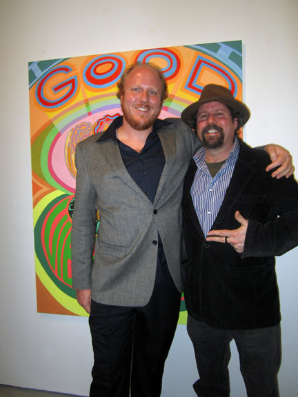
ERIK DEN BREEJEN with FREIGHT+VOLUME founder/director NICK LAWRENCE . . . at the opening.
Erik’s painting: ‘Good Vibrations’ . . . behind them.
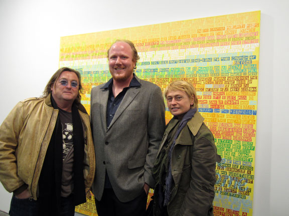
painter ERIK DEN BREEJEN at center. THORPE SHUTTLEWORTH at the left . . . INNA BABAEVA on the right.
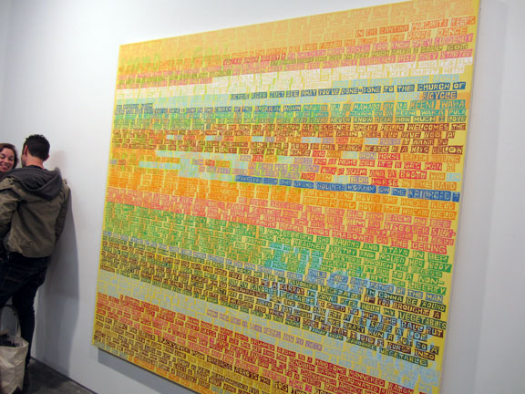
the paintings were first and foremost color field paintings. though some might take issue and say the conceit: illustrating the entire lyrics to the recently released Beach Boys magnum opus, ‘SMILE’ – was what turned the trick.
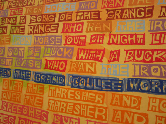
and the man certainly knows how to run – with FONT !!
his painterly DIY font – had comic book ‘block’ calligraphy – by the hand.
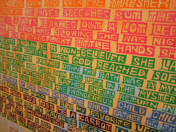
but then the surfaces – also heaved and waved – just like . . . music ?
rose and waved out . . . just like classic Beach Boy harmony. classic, so teeny-bopper labelled, and yet so so fashion forward – we are only really getting the whole big picture, now.
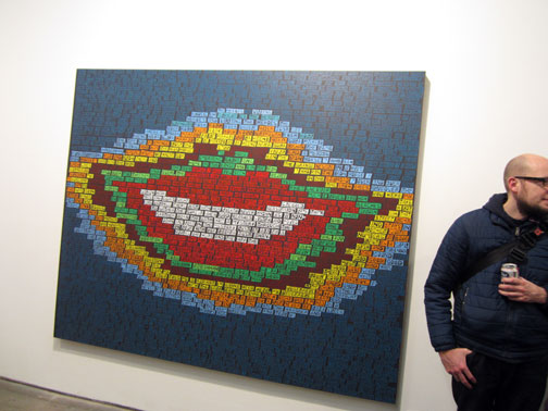
this landmark or exhibit ‘title’ painting – actually incorporated the text – into its overall composition: ‘SMILE’, and not just its component brick bat – quickly paced, and boldly juxtaposed color text blocks.
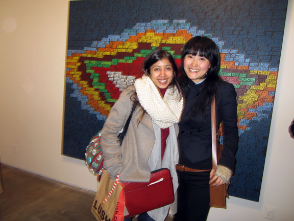
HIBA SCHAHBAZ and MI JU are studio mates.
Hiba is a traditional miniature painter from Pakistan who is studying in the studio fine art graduate program at Pratt. Mi Ju who originally comes from Korea by way of San Francisco, currently lives and works in NYC. She will be having a show at FREIGHT +VOLUME next September.
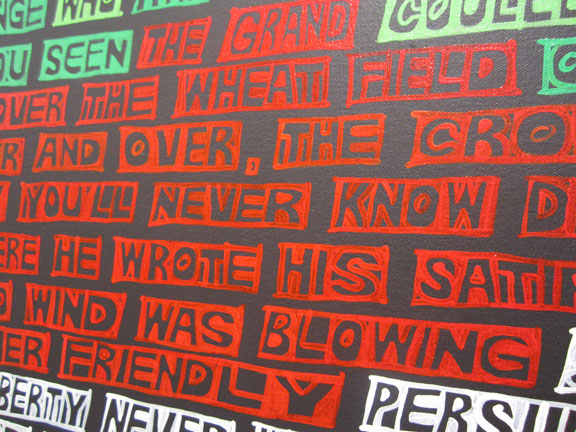
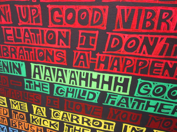
close-up color block caption-like calligraphy and color block saturated hues – ERIK DEN BREEJEN – ‘SMILE’.
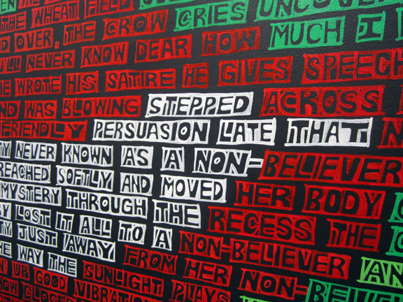
some of the color contrasts were very stark.
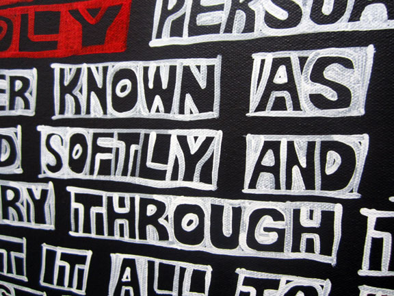
and even, extremely: black and white !!
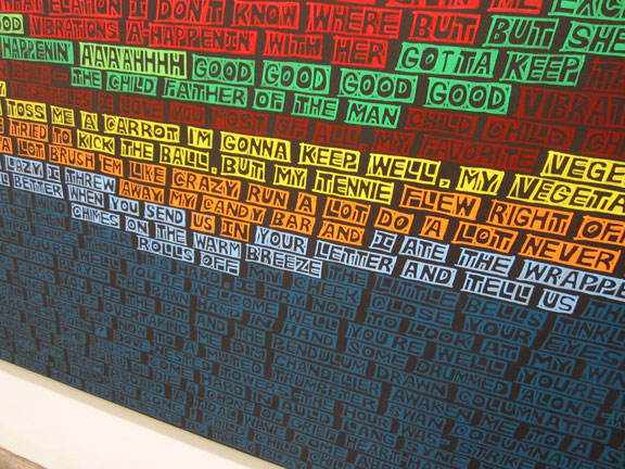
the capital block letters, the individual block unit words, and the contrasting or harmony building color hues – aggregated into waves – from different angles. combined with the frontal plane compositions . . . there was a sense of deep emotion behind the design, behind the concept.
according to the gallery press release, just like: sound waves in music. just like the field of emotions – in the song lyrics.
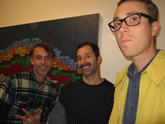
from left:
JULES De BALINCOURT, PETER SIMENSKY, and ZACK HARRIS.
Jules de Balincourt is a really wired, compelling and animated dynamo – in action. on canvas and in life !! never mind his recent blow-up on the auction charts. he told me I was an: info sponge. quelle right on. he got my number.
wow, for sure – I dug that !!
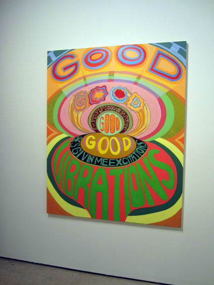
ERIK DEN BREEJEN: ‘GOOD GOOD VIBRATIONS’ . . .
file under: tragedy, just like ‘PET SOUNDS’ . . . way ahead of its time.
from the gallery liner (press release) notes:
“There is a dark side to the Beach Boys’ career, even though they were arguably one of the most popular bands of their time, producing songs which are just as warm, uplifting and California surf-invoking now as when they were written. ‘Good Vibrations’ broke new ground with its psychedelic overtones and by demonstrating the band’s ability to use the recording studio as an instrument. But many feel the band never lived up to its promise, and remained stuck in teenybopper cult status.”
to which I say – fie on them !! and no wonder Brian Wilson lost it. esp when the Beatles’ ‘Sergeant Pepper’s Lonely Heart Club Band’ swept the Beach Boys’ ‘Good Vibrations’ – apparently – off the charts.
in retrospect – quelle sad loss. what a wrong . . . vote-off.
again from the press release: “Brian Wilson, already sinking into the quagmire of drug-induced paranoia and depression, never quite recovered from that displacement”.
displacement – what a powerful word, if you think about it. in a lot of ways, these paintings are about the ‘displacement’ – of words, as in their meanings – by the overall painting. the meanings taken over by the dance and bold steps of the hi=power contrasts of shifting letter colors, and the resultant aggregate color ‘hue’ fields . .
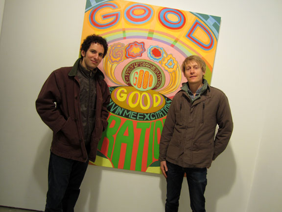
PETER GERAKARIS, and KRISTOF WICKMAN, both Hunter MFA alum – in front of ERIK DEN BREEJEN’S – ‘GOOD GOOD VIBRATIONS’.
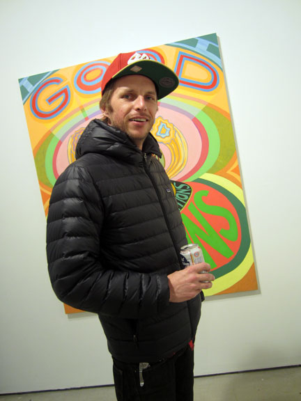
MAXXX (!!) VON WILLMAN has a studio in Bushwick by way of San Fran(cisco) and even, if you stretch it – Marin County, back in the day . . . when Van Morrison ruled.
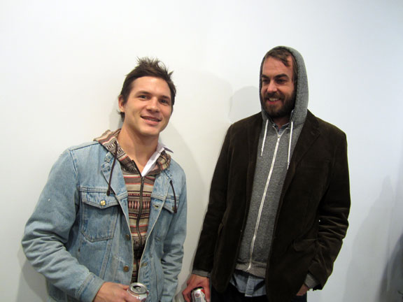
TRAVIS PRATT and F+V artist ANDREW GUENTHER.
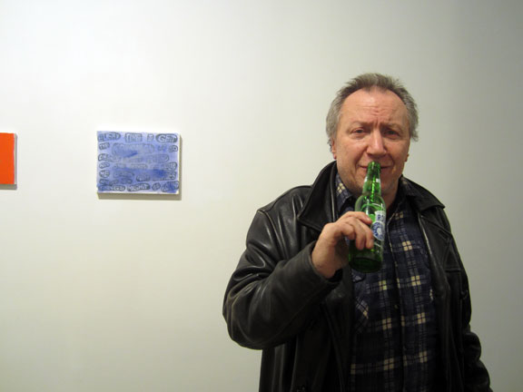
SIMON CERIGO gave Andrew Guenther his very first show in NYC – back in the late 90s when Simon was the Director of the Daniel Silverstein Gallery, and Andrew was the – intern.
as artlovers sometimes music reviewer, Simon is also enjoying a ‘moment in the sun ‘ – his very first review for us in 2005 . . .
ANTONY and the JOHNSONS – are now playing RADIO CITY MUSIC HALL !!
(7 years later)
see: MOMA/THE MUSEUM of MODERN ART/NYC has commissioned ANTONY and THE JOHNSONS: SWANLIGHTS for a one night only performance at RADIO CITY HALL, NYC – this upcoming JAN 26, 2012.
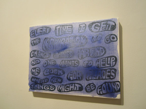
but it was the little blue painting to the left – that really caught our attention . . .
“EVERY TIME I GET THE INSPIRATION TO GO CHANGE THINGS AROUND NO ONE WANTS TO HELP ME LOOK FOR PLACES WHERE NEW THINGS MIGHT BE FOUND” – THE BEACH BOYS by way of ERIK DEN BREEJEN.
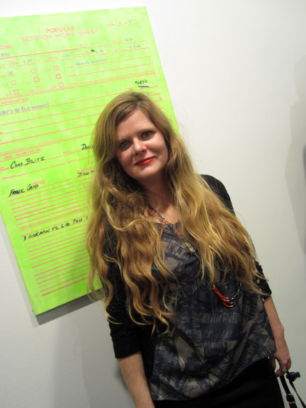
painter MARIA CALANDRA, longtime GF/buddy of Erik’s – in front of his atypical – ‘POPULAR SESSION WORK SHEET’.
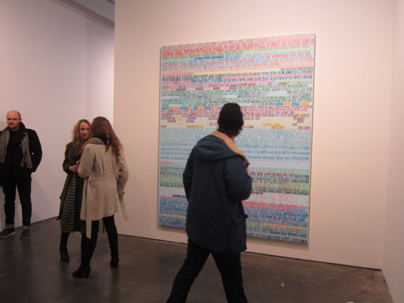
this particular large canvas – of color coded word blocks – was more typical, and than again not. being so ghostly and more diffused, over-all.
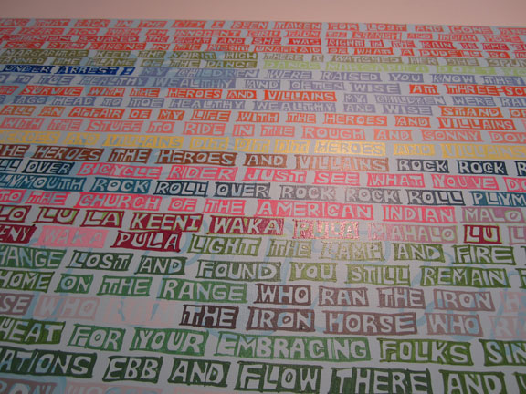
it had a striking ambiance, and broke down, into smaller almost cascading units – really well, too.
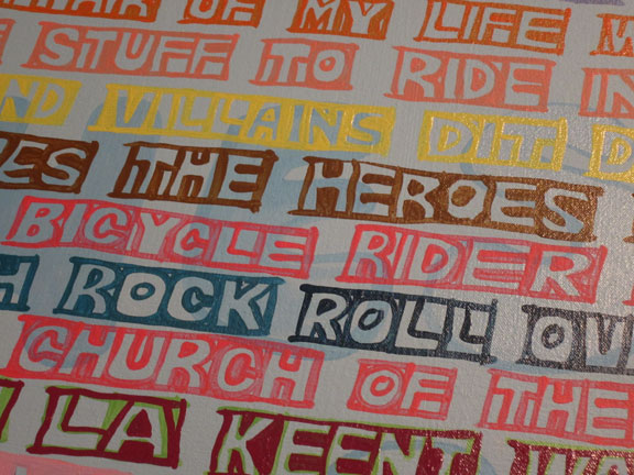
“VILLAINS and HEROES” – yes, I remember these Beach Boys lyrics – well.
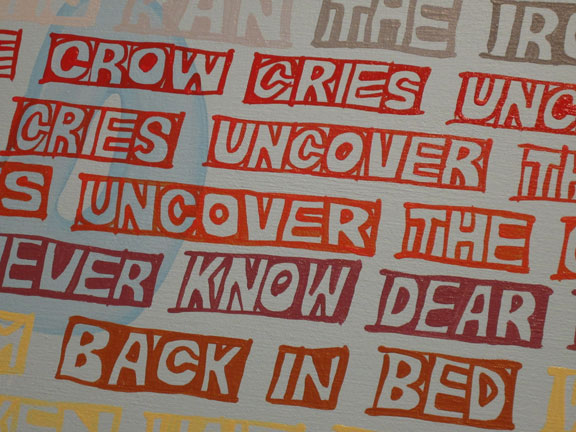
“UNCOVER” . . . “UNCOVER”. you can see readily the almost comic book caption quality – of the hand painted block letter calligraphy.
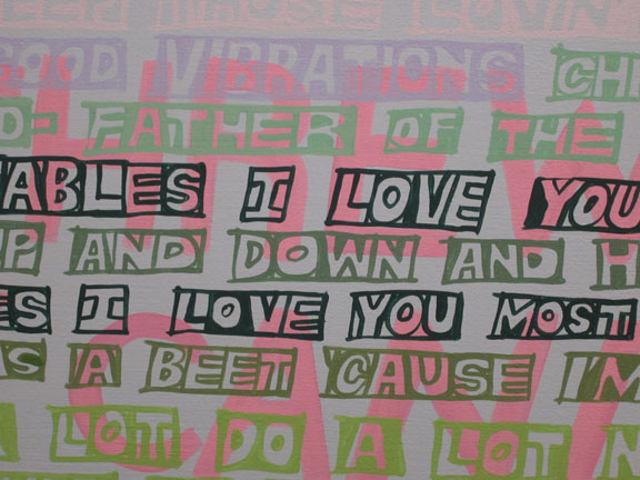
though of course – its ultimately, way more: painterly.
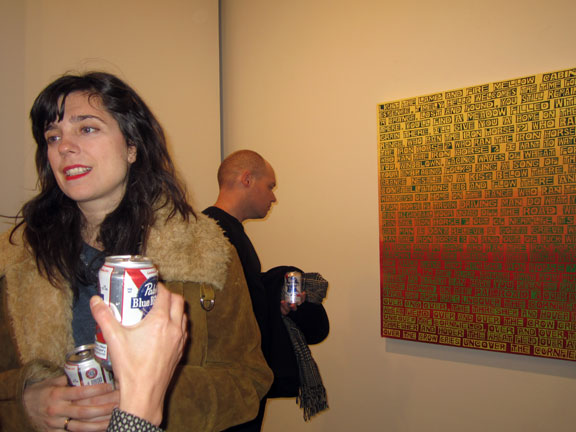
I never really thought of this before, but aren’t painted lips – just like . . . letters ?
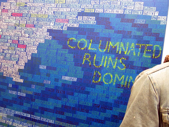
detail, ERIK DEN BREEJEN . . . “COLUMINATED RUINS . . . ”
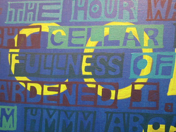
“DOMINO” . . . !!
go back and check out – the overall – big picture.
just like dominoes – all falling down, one after the other.
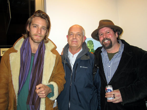
ADAM HAGGIAG, JAMES KALM, and NICK LAWRENCE.
yes, JAMES KALM is the guy who rides around on his bike and videotapes many many Big Apple openings.
see: THE JAMES KALM REPORT
see: JAMES KALM & LOREN MUNK
see: JAMES KALM’S – YouTube Channel
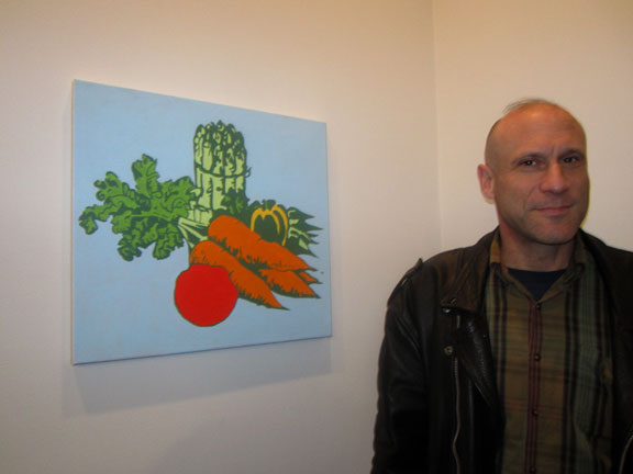
STEVE JOHNSON. and, that little color intense still life veggie painting ? – by ERIK DEN BREEJEN. I told you he was a color field painter.
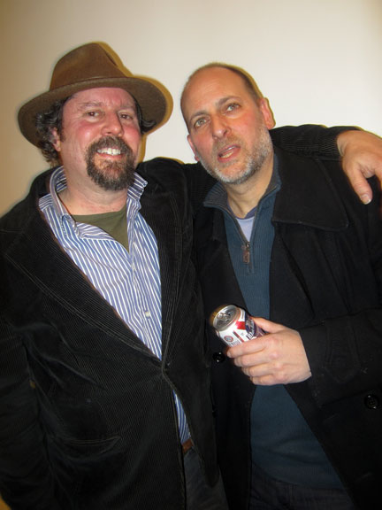
NICK LAWRENCE with F+V gallery artist – DAVID BASKIN.
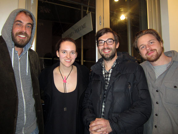
from left:
F+V artist ANDREW GUENTHER, F+V intern HANNAH HINDS, Andrew’s friend DANIEL HEIDKAMP, and last but not least, PHILLIP DMOCHSKI, F+V Assistant Director.
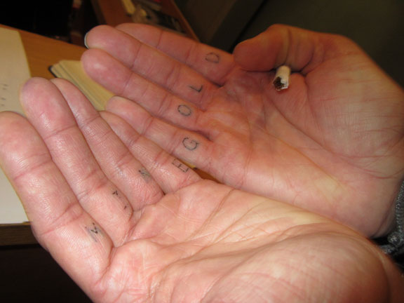
MINE GOLD – just think on that !!
ANDREW GUENTHER shows us his new finger tattoo.
wow – everybody’s getting into the letters game !!
PHOTOS: NANCY SMITH, NYC. DEC 10, 2011

